Coca-Colaコカ・コーラ
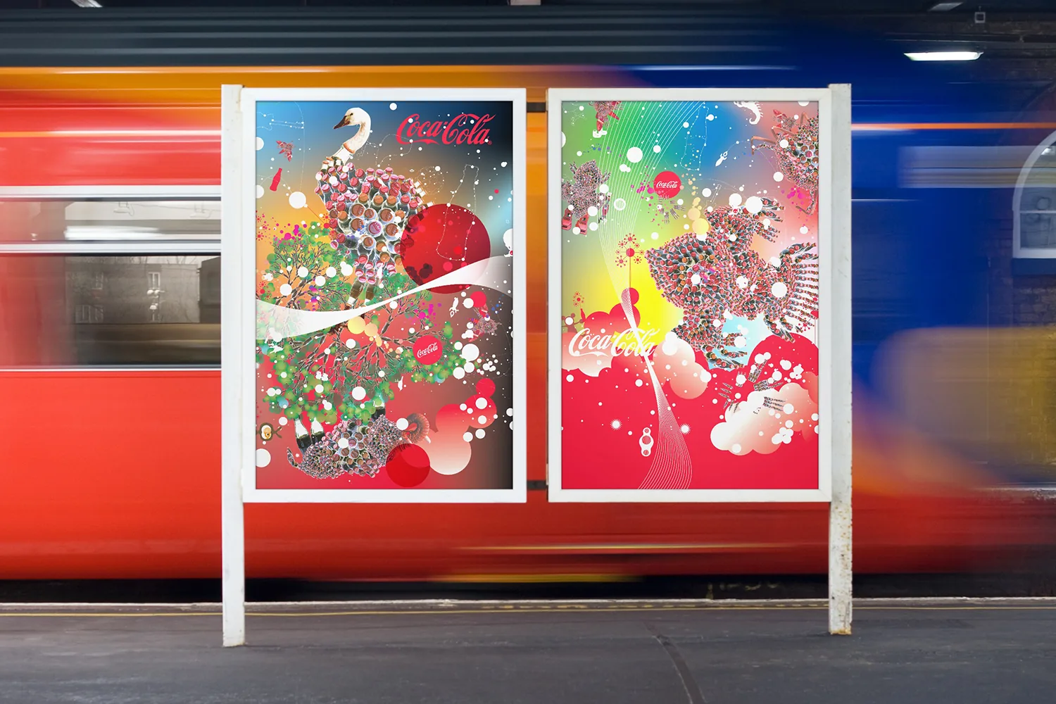
Two global visual worlds for Coca-Cola — one built out of bottle silhouettes.ボトルの輪郭から生まれた、2 本のグローバルビジュアル。
Challenge課題
Coca-Cola wanted to refresh its global touchpoints — billboards, vehicles, packaging, coolers — without spending the equity of the world's most recognized identity. A new look had to work from Times Square down to a street-corner cooler, across very different markets.コカ・コーラは、看板、車両、パッケージ、クーラーといった世界中の接点を刷新したかった。ただし、世界でいちばん知られた顔の資産は削れない。新しい見た目が、タイムズスクエアから街角のクーラーまで、まるで違う市場で通用しなければならなかった。
Solution解決
Instead of one monolithic system, I developed two parallel worlds at Ogilvy's Brand Integration Group, under VP of Design David Butler. Coke-Animal World turned the bottle silhouette into creatures — including a giant swan billboard in Times Square. SketchVibe World went hand-drawn and warm. The decisive move was giving the brand two contrasting but coherent worlds to flex across six-plus formats and cultures.ひとつの巨大な仕組みではなく、Ogilvy の Brand Integration Group で、デザイン VP の David Butler のもと、2 つの世界を並行してつくった。「Coke-Animal World」はボトルの輪郭を生き物に変えた。タイムズスクエアの巨大な白鳥の看板もそのひとつ。「SketchVibe World」は手描きの温かさでまとめた。決め手は、対照的でいて一貫した 2 つの世界をブランドに渡し、6 種以上の媒体と文化に合わせて使い分けられるようにしたこと。
Impactインパクト
At Ogilvy BIG I designed two parallel Coke worlds — creatures and a modular bottle system.Ogilvy BIG でコークの二つの世界観 — クリーチャーとモジュラー瓶 — を並行して設計した。
What I handled担当フェーズ
- Researchリサーチ
- Business / Strategyビジネス/戦略
- Conceptコンセプト
- UX / UIUX/UI
- Design Systemデザインシステム
- Prototypeプロトタイプ
- Build実装
- Launch / Growthローンチ/グロース
Coke-Animal World: creatures made of bottles Coke-Animal World — ボトルでできた生き物
The first direction took the one shape everyone already recognizes — the contour bottle — and built a cast of creatures entirely out of its silhouette: an elephant, a swan, a whole playful universe. It was made for street-level impact, on billboards, buses and coolers, and one of the creatures, a giant swan, went up as a billboard in Times Square. 一つ目の方向は、誰もが知っている形、あのボトルから始めた。その輪郭だけを組み合わせて、象や白鳥をつくる。遊び心のある生き物たちの世界だ。狙いは街頭で目に飛び込むこと。看板、バス、クーラーに展開し、巨大な白鳥はタイムズスクエアの看板になった。


SketchVibe World: the same brand, drawn by hand SketchVibe World — 同じブランドを、手描きで
The second direction went the other way on purpose: loose, hand-sketched line work that made the brand feel warm and approachable rather than monumental. Because it is a drawing style rather than a character set, it stretched across far more surfaces — cans, letterhead, wall murals, transit lightboxes, coolers and vehicle wraps. Two contrasting worlds, both unmistakably Coca-Cola, gave markets a choice instead of a single template. I developed both directions, and the illustration systems behind them, as Senior Designer at Ogilvy’s Brand Integration Group, under VP of Design David Butler. 二つ目は、あえて逆へ振った。ゆるい手描きの線で、記念碑のようなブランドを、温かく近づきやすいものにする。こちらはキャラクターではなく描き方なので、ずっと多くの面に広がった。缶、便箋、壁画、駅の電飾看板、クーラー、車両。対照的でいて、どちらも間違いなくコカ・コーラ。市場ごとに、ひとつの型ではなく選択肢を渡せた。両方の方向と、その元になるイラストの仕組みをつくった。立場は Ogilvy の Brand Integration Group のシニアデザイナー。デザイン VP の David Butler のもとで進めた。


