KonosakiKonosaki
One idea — this, and ahead — carried from the logo to a live bilingual site.「この」と「先」。ロゴから公開中の二言語サイトまで、ひとつの考えで通した。
Visit the live site公開中のサイトを見るChallenge課題
Konosaki needed a full brand system and a live bilingual website — logo, guidelines, collateral and presentation templates, plus a working site — with no in-house design or engineering team and no studio budget to hand it to.Konosaki には、ロゴから稼働するバイリンガルサイトまで、ブランド一式が要った。社内にデザインチームもエンジニアもおらず、制作会社に頼む予算もなかった。
Solution解決
I designed and built the whole system solo, AI-assisted, through Creativity Is Everywhere LLC — one idea, a bridge between kono ('this') and saki ('ahead'), carried from the primary lockup through the color and type system, business cards and a 12-master presentation deck, into a live Next.js/React site with parallax storytelling and bilingual page transitions.戦略からロゴ、名刺、12 種のプレゼン資料、そして Next.js/React 製の公開中サイトまで、Creativity Is Everywhere LLC として 1 人で AI を使いながら作り切った。軸は「この(kono)」と「先(saki)」を結ぶ橋、というひとつの発想。色とタイポグラフィのシステム、パララックスの語り口とバイリンガルのページ遷移まで、この一つの考えで貫いた。
Impactインパクト
I designed and built the Konosaki bilingual site solo, AI-assisted, end to end.Konosaki の二言語サイトを AI 支援で一人で設計から実装まで行った。
What I handled担当フェーズ
- Researchリサーチ
- Business / Strategyビジネス/戦略
- Conceptコンセプト
- UX / UIUX/UI
- Design Systemデザインシステム
- Prototypeプロトタイプ
- Build実装
- Launch / Growthローンチ/グロース
A bridge between kono and saki 「この」と「先」を結ぶ橋
The primary lockup places the symbol at the heart of the name — a bridge sitting between kono ("this") and saki ("ahead"), connecting the present to what comes next. The mark always leans forward, suggesting motion across borders. プライマリーロックアップは、シンボルを名前の真ん中に置いた。「この(kono)」と「先(saki)」のあいだに橋を渡し、今と、その先をつなぐ。マークは常に前へ傾き、国境を越える動きを示している。


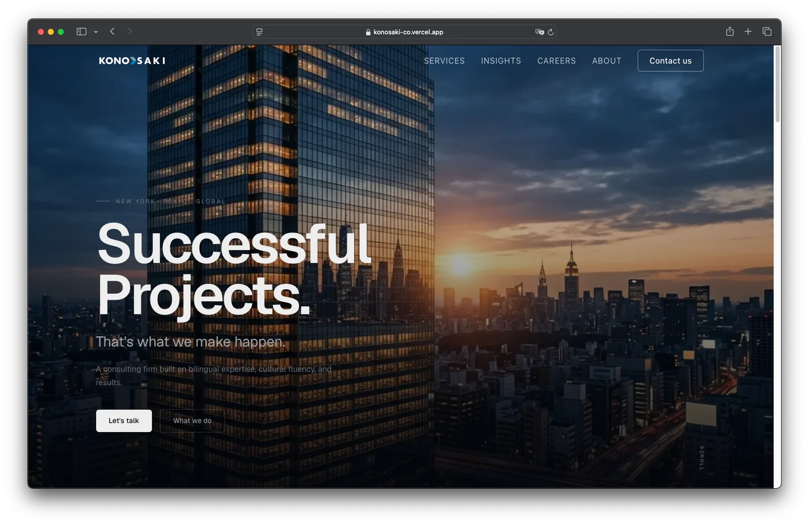
The brand in motion, on the live site 動きの中で見るブランド、公開中のサイト
The bilingual site carries the bridge concept into interaction: parallax storytelling and seamless page transitions, so crossing between Japanese and English feels like part of the same design idea rather than a language switch bolted on. 2 言語サイトでは、橋の発想をインタラクションにまで持ち込んだ。パララックスによる語りと、途切れないページ遷移。日本語と英語を行き来する体験そのものが、後付けの言語切替ではなく、デザインの一部になっている。


One system, down to the business card 名刺の一枚まで、同じシステムで
The system reaches every physical and digital touchpoint: a Japanese-standard 91×55mm business card carrying only the lockup on the front, an A4 letterhead with a single hairline footer, an email signature keeping the symbol at 46px, and a 12-master presentation deck — cover through closing — with one accent color per slide, always from the brand palette. このシステムは、紙とデジタルの接点すべてに及ぶ。日本標準 91×55mm の名刺は、表にロゴだけを置いた。A4 のレターヘッドは、罫線 1 本の控えめなフッターのみ。メール署名はシンボルを 46px に固定し、12 種のプレゼン資料はカバーからクロージングまで、スライドごとに 1 色のアクセントをブランドパレットから選んで使う。