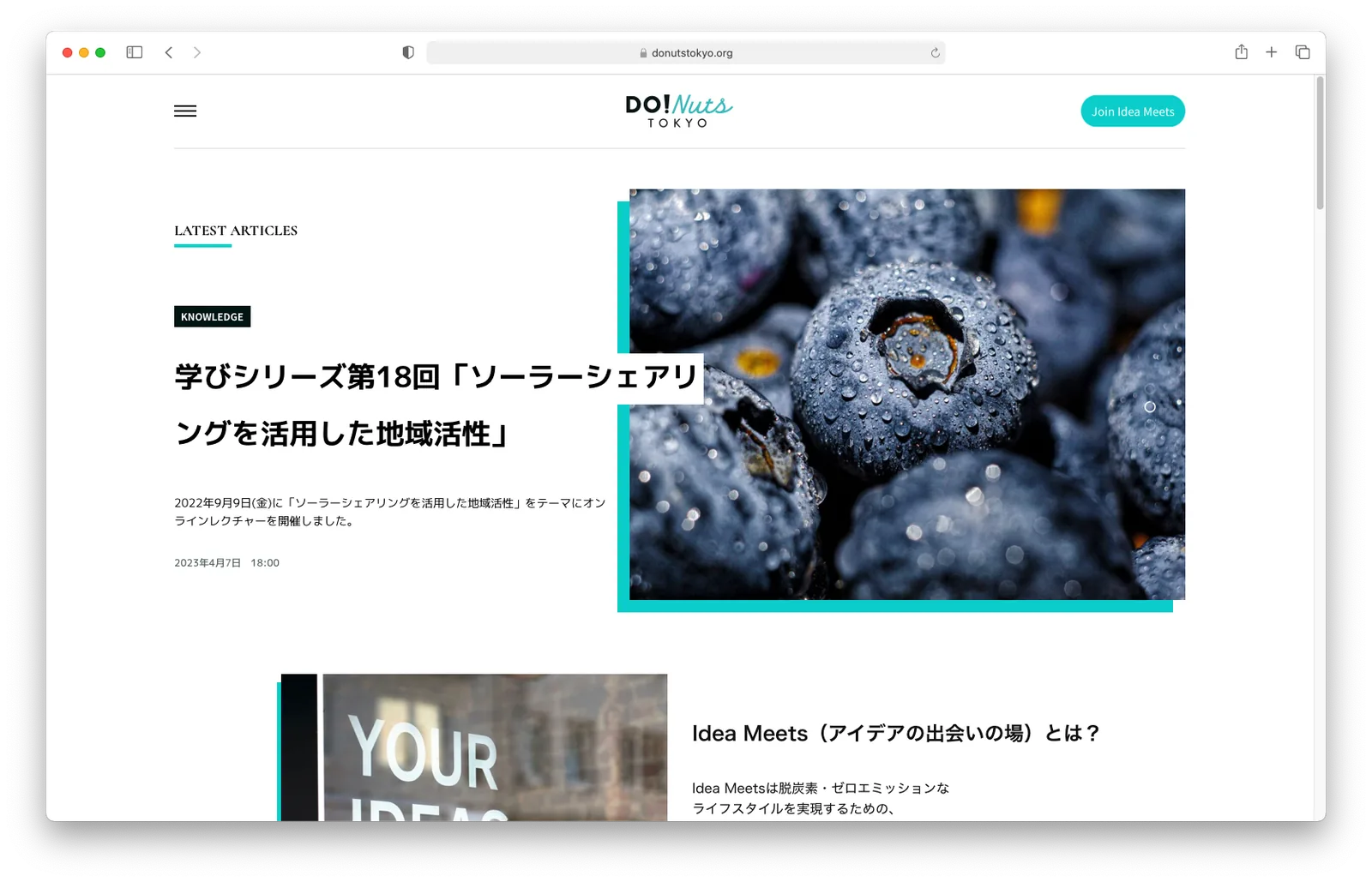
Do! Nuts TokyoDo! Nuts Tokyo
Tokyo's citizen-facing sustainability brand, run as workshops with youth ambassadors.東京の市民向けサステナビリティブランド。若者アンバサダーとのワークショップで動かした。
Challenge課題
To hit near-zero CO2 emissions by 2050, Tokyo needed more than policy — it needed a platform that could engage citizens, corporations and especially youth in sustainability, making climate action feel accessible and participatory rather than bureaucratic.東京都が 2050 年までに CO2 排出実質ゼロを目指すには、政策だけでは足りない。市民・企業、特に若い世代を巻き込む基盤が要った。気候変動への取り組みを、お役所仕事ではなく身近で参加したくなるものにする必要があった。
Solution解決
I launched DO! NUTS TOKYO as a citizen-facing sub-brand, reapplying the brand DNA built for Value Frontier to a public platform: a vibrant identity system, a digital hub for content and events, and workshop frameworks that generated sustainability proposals from youth ambassadors across three cohorts. The identity won the 2021 American Graphic Design Award.市民向けの姉妹ブランド DO! NUTS TOKYO を立ち上げた。Value Frontier のために作ったブランドの核を、公共向けプラットフォームに転用した。生き生きとしたビジュアルシステム、コンテンツとイベントの拠点となるデジタル基盤、そして若者アンバサダーから提案を引き出すワークショップの枠組みを作り、制度は 3 期まで続いた。このブランドは 2021 年 American Graphic Design Award を受賞した。
Impactインパクト
I launched DO! NUTS TOKYO — citizen brand, events hub, and digital identity for the sub-brand.DO! NUTS TOKYO を立ち上げ、市民向けブランドとイベントハブをつくった。
What I handled担当フェーズ
- Researchリサーチ
- Business / Strategyビジネス/戦略
- Conceptコンセプト
- UX / UIUX/UI
- Design Systemデザインシステム
- Prototypeプロトタイプ
- Build実装
- Launch / Growthローンチ/グロース
Recognized industry-wide 業界の賞という形で認められた
Creativity Is Everywhere + KUDOS Design Collaboratory received the 2021 American Graphic Design Award for the DO! NUTS TOKYO brand identity — recognition that helped carry the youth ambassador program into its third cohort. Creativity Is Everywhere と KUDOS Design Collaboratory は、DO! NUTS TOKYO のブランドアイデンティティで 2021 年 American Graphic Design Award を受賞した。この評価が、若者アンバサダー制度を 3 期目まで押し上げる後押しになった。

One identity, built for every context 場面ごとに使い分けられる、1 つのアイデンティティ
The visual system ships with multiple logo configurations — stacked, two-line, in black, white and blue — so the identity holds up on a Zoom background, a certificate or a mobile screen alike. ビジュアルシステムには、縦積み・2 行組、黒・白・青といった複数のロゴ構成を用意した。Zoom の背景でも、賞状でも、スマホ画面でも同じアイデンティティとして成立する。


Starting from three unheard voices 聞かれていなかった 3 つの声から始める
Stakeholder research surfaced the same gap from three sides: corporations struggling to fold sustainability into strategy, consumers who felt their voice wasn't heard, and experts struggling to educate the public. The workshop frameworks and youth ambassador program were built to sit between all three. ステークホルダー調査では、3 つの立場から同じ隙間が見えた。サステナビリティを戦略に落とし込めない企業、声が届いていないと感じる生活者、一般向けの説明に苦労する専門家。ワークショップの枠組みと若者アンバサダー制度は、この 3 者の間に立つように設計した。


