Value FrontierValue Frontier
A sustainability consultancy rebuilt from its brand DNA out to its signage.ブランドの DNA から看板まで、サステナビリティ企業をつくり直した。
Challenge課題
Value Frontier had established itself as a sustainability consulting firm, but its ambitions had outgrown its identity — it was expanding into high-end fashion and other industries, markets that demanded a more sophisticated, contemporary brand presence than the existing identity gave it.Value Frontier はサステナビリティ・コンサルティング企業として実績を築いていたが、事業の野心にブランドが追いついていなかった。高級ファッションをはじめとする新しい業界へ広がる中で、これまでのアイデンティティでは通用しない、より洗練された存在感が求められていた。
Solution解決
I led the rebrand from brand DNA development through stylescapes to full design applications, uncovering the firm's core values and translating them into a visual language that read as premium and purposeful — a single identity system working across corporate collateral, environmental signage, digital platforms and print. The same brand DNA later became the foundation for the DO! NUTS TOKYO sub-brand, a 2021 AGDA winner.ブランドの核づくりからスタイルスケープ、実際の適用物まで、一貫してリブランディングを主導した。企業の価値観と戦略上の狙いを掘り起こし、上質さと目的意識の両方が伝わるビジュアル言語に落とし込んだ。企業案内、環境サイネージ、デジタル、印刷物まで、1 つのアイデンティティシステムで貫いた。ここで作ったブランドの核は、後に姉妹ブランド DO! NUTS TOKYO の土台となり、2021 年 American Graphic Design Award を受賞した。
Impactインパクト
I led Value Frontier’s rebrand from DNA through stylescapes to full applications.Value Frontier のブランド DNA からスタイルスケープ、展開までリブランドを主導した。
What I handled担当フェーズ
- Researchリサーチ
- Business / Strategyビジネス/戦略
- Conceptコンセプト
- UX / UIUX/UI
- Design Systemデザインシステム
- Prototypeプロトタイプ
- Build実装
- Launch / Growthローンチ/グロース
Two wings, two hearts, two leaves, V and F 2 枚の翼、2 つの心、2 枚の葉、そして V と F
The mark was built from the letters V and F themselves, read simultaneously as wings, hearts and leaves — a single geometry benchmarked against iconic brand marks until it held up at every scale, from a favicon to a building's signage. ロゴマークは V と F という文字そのものから作った。同時に翼にも、ハートにも、葉にも読める形にした。名だたるブランドマークと並べて検証を重ね、favicon から建物のサイネージまで、あらゆる大きさで成立する 1 つの幾何学に絞り込んだ。


One system, printed, worn and hung on the wall 1 つのシステムを、印刷物にも、持ち物にも、壁にも
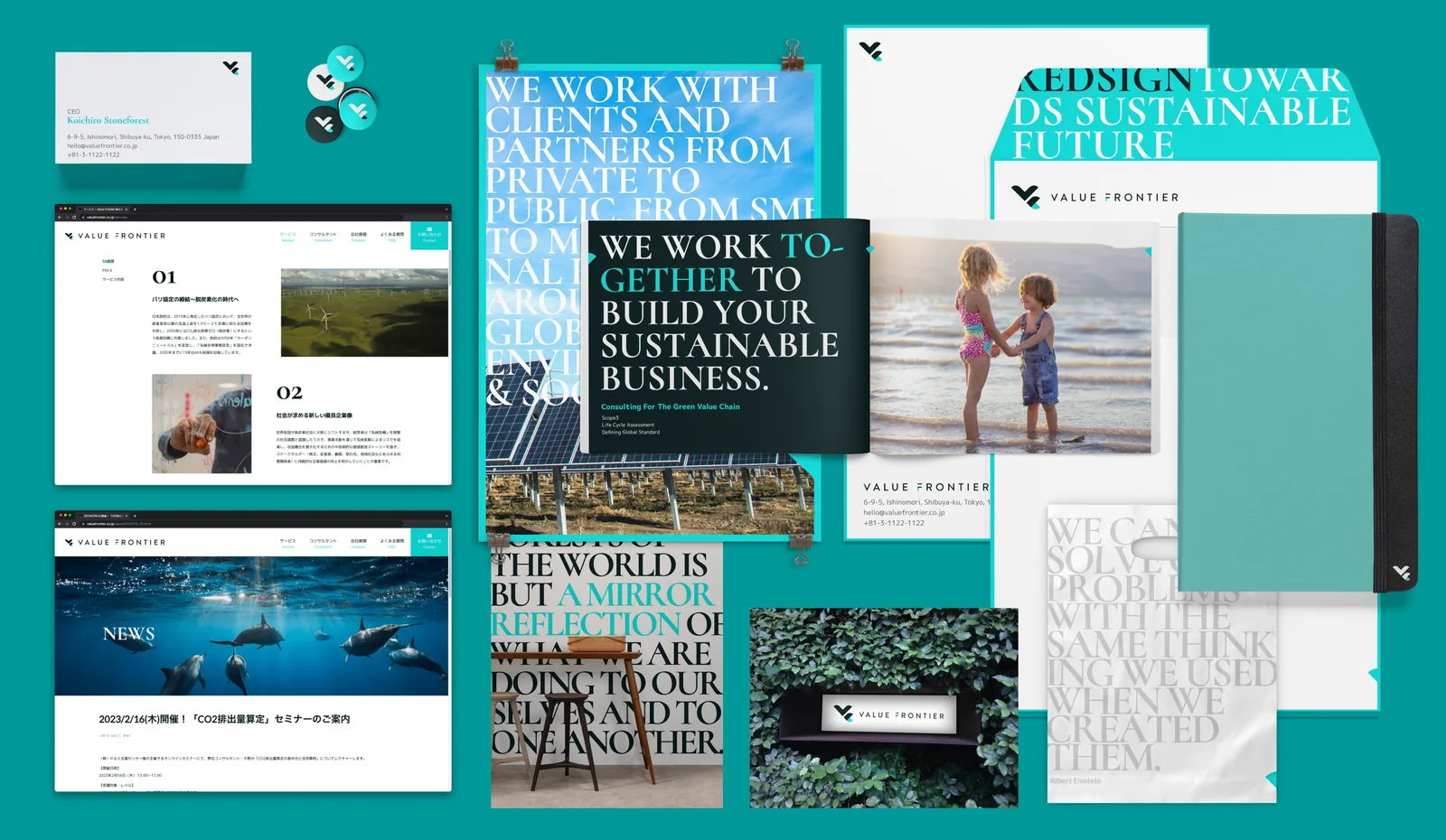
The identity was designed to work across every touchpoint at once — a magazine spread on climate action, office signage set in greenery, business cards and bags — so the brand read the same whether a client held a card or walked into the office. アイデンティティは、あらゆる接点で同時に機能するよう設計した。気候変動を扱う雑誌の誌面、緑に囲まれたオフィスのサイネージ、名刺やバッグ。クライアントが手に取る名刺でも、実際にオフィスを訪れたときでも、同じブランドとして見える。


The same brand DNA, seeding a second brand 同じブランドの核から、もう 1 つのブランドが生まれた
The core values and visual language developed here didn't stay inside Value Frontier — they became the foundation for DO! NUTS TOKYO, a citizen-facing sustainability sub-brand that went on to win the 2021 American Graphic Design Award. ここで作った企業の価値観とビジュアル言語は、Value Frontier 社内にとどまらなかった。市民向けの姉妹ブランド DO! NUTS TOKYO の土台となり、そのブランドは 2021 年 American Graphic Design Award を受賞した。
See the DO! NUTS TOKYO case study ↗ DO! NUTS TOKYO の事例を見る ↗